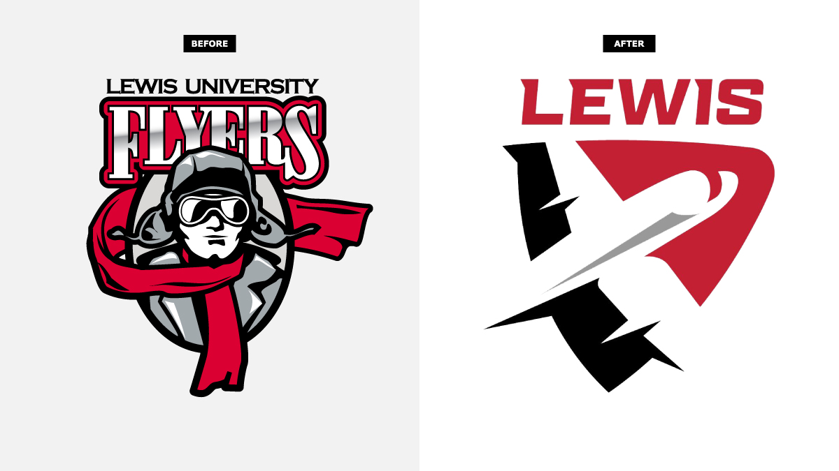
If you haven’t noticed, we have a new school logo, and there are quite a few mixed emotions about it. The logo is specific for athletics and if you are new to our university, you may not know but the previous logo was named Bedcheck Charlie. Some thought that Charlie was unique and authentic, while other students (including me), claimed him to be outdated. Not that I felt embarrassed wearing a random man on my swim cap or clothing, I didn’t see Charlie to be visually appealing. It was definitely time for a logo change.
Bedcheck Charlie was around for nearly 70 years, so this was an important historical change for the university. The reason to retire him was due to the logo standards we have today. Meaning, logos nowadays are more simplistic and clean, which is exactly how our new logo looks.
Unfortunately to say, Charlie is not mighty or powerful enough of a representation for the strong athletics teams we have. He did have a cool story that went along with him way back when Lewis first became a university and throughout the years it digressed. Keeping traditions alive begins with the students and the students seem to not know the true story behind Charlie. Charlie was a made up ghost to keep students in their beds so they wouldn’t sneak out to do what normal college students do, which is where the “Bedcheck” comes from. He was never some creepy old man or anything twisted like some students made him out to be.
Some have said they either really like the new logo, or despise it and want to bring back Charlie. I say that Charlie had his time and now Lewis should move on. With the new logo, Lewis can make a new name for itself. Although we are a small NCAA DII school, we have competitive and successful athletic teams. Almost all of our athletics make national champions or win conference championships. For example, Women’s Cross Country, Women’s Volleyball, Men and Women Track and Field and Softball teams all won the 2022-23 GLVC Championships. But Charlie as the logo never really suited a national championship winning team for me.
But regardless, the new logo features a modern plane on a shield with the letters “LEWIS” below the image. It utilizes our previous colors, black, red and white. Now, with the modern and improved logo, there have been many comments on it. And of course, it is impossible to make everyone happy, but we could have gone with a much worse logo.
When I first came to Lewis, I thought that the other logos in our GLVC conference looked much better than ours and that our school should consider switching. And we finally did and for the better. This new logo now screams to me “National Champion Team!” or “GLVC Champions!”
Since Charlie has been around for so long, it will take time for Lewis to completely transition away from all the merchandise and marketing with his face on it. Whether you liked Charlie or not, you cannot get rid of him that easily. As for the new logo, hopefully students begin to let it grow on them and see that this is just another way for our university to grow.
Photo Credits: Julia Lesnicki
